The Mistakes That Secretly Sabotage Your Conversions
You can pour thousands into ads, post daily on social media, and obsess over the latest digital trends – but if your website is working against you, congratulations: you’ve just built the world’s fanciest online brochure. The truth is, most conversion problems don’t stem from bad marketing; they stem from websites riddled with mistakes that quietly push visitors away before they even consider becoming customers. Let’s dissect the seven biggest offenders that might be killing your conversions.
1. Slow Loading Speed: Because Nobody Waits Anymore
If your website takes longer than three seconds to load, your visitors are already gone, probably off Googling your competitor. Website speed isn’t just about user impatience – it’s a full-blown SEO issue. Search engines love fast, optimized sites, and they reward them with higher rankings. So when your site drags, you’re not just losing customers; you’re tanking visibility too. And in an age where capturing users’ fleeting attention is harder than convincing people that pineapple belongs on pizza, speed matters more than you think.
2. Poor Mobile Optimization: The “Pinch and Zoom” Nightmare
We live in a mobile-first world, yet too many businesses still serve up sites that look like they were designed for desktop monitors circa 2009. Nothing screams “we don’t care about user experience” louder than forcing visitors to pinch and zoom their way through your content. With the majority of traffic coming from mobile, bad mobile design isn’t just inconvenient – it’s the fastest way to kill trust. And without trust, conversions don’t happen. Simple as that.
3. Confusing Navigation: The Bermuda Triangle of Websites
A website should guide visitors like a well-lit path, not trap them in a labyrinth of dropdown menus, hidden links, and vague “Learn More” buttons. If users can’t find what they’re looking for in seconds, they’ll leave – probably muttering a few choice words on the way out. Navigation should be clean, logical, and intentional. Clarity doesn’t just make life easier; it directly drives conversions because people who know where to click are people who actually do click.
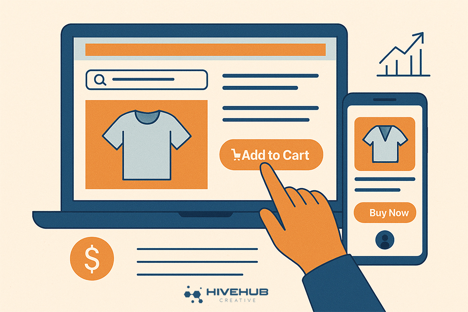
4. Weak or Missing CTAs: The Invisible Sales Pitch
Your call-to-action should be the loudest voice in the room, not a shy whisper tucked in the corner. A bland “Submit” button blends into the background; a bold, benefit-driven CTA tells visitors exactly what they’re getting and why it matters. Think of CTAs as your virtual salesperson – they either seal the deal or let the customer walk out the door. And just like in real life, a confident pitch works better than mumbling into your shoes.
5. Ignoring SEO Basics: The Silent Killer
Yes, SEO still matters. No, it hasn’t been replaced by TikTok trends or the latest AI hack. Ignoring basic SEO – like keyword use, metadata, and fixing broken links – means your site is invisible to the very people searching for what you offer. And invisibility doesn’t convert. You don’t have to become an SEO wizard, but aligning with strategies that focus on what actually matters can be the difference between a thriving funnel and a ghost town.
6. Bad Content & Messaging: Because Nobody Loves Walls of Text
Your website copy should speak like a human, not like a corporate robot armed with a thesaurus. Walls of jargon-heavy text don’t build trust; they confuse people. If your value proposition isn’t crystal clear within seconds, you’ve lost them. Good content tells a story, builds connection, and reinforces your brand voice. It’s the difference between sounding like a company people want to work with versus a company people scroll past. Pairing strong storytelling with design that actually works – like in the principles of maximizing website success – turns browsers into buyers.
7. No Social Proof: Why Should Anyone Believe You?
Here’s the harsh truth: nobody cares what you say about yourself. They care what other people say about you. Social proof – whether it’s testimonials, reviews, case studies, or even logos of brands you’ve worked with – is the trust signal that converts skeptics into customers. Without it, your site looks more like a student project than a credible business. In an era where trust is currency, skipping this step is like opening a store with no products on the shelves.
Your Website Isn’t a Brochure
Your website isn’t supposed to sit there looking pretty. It’s supposed to work. It’s a sales machine, a trust builder, and your brand’s first impression rolled into one. Ignore the mistakes above, and you’ll keep losing conversions while wondering why your marketing isn’t paying off. Fix them, and suddenly your website becomes the high-performing business tool it was always meant to be.
Stop letting your website act like that one co-worker who shows up late, contributes nothing, and still collects a paycheck. At HiveHub Creative, we build sites that hustle harder than your sales team. Ready to make your website pull its weight? Let’s talk.